CERAMICS & PRINT 2012
Exhibition 29 October - 24 November 2012
Ceramic Print in Contemporary International Ceramic Art
In the twenty years since the first edition of Paul Scott's handbook CERAMICS AND PRINT appeared, printed surfaces have become commonplace in contemporary ceramic art practice.
LINK - The book: amazon.com/Ceramics-Print-New-Paul-Scott
 Paul Scott is an artist best known for his research into ceramics and print.
 His practice is diverse, so as well as making individual artworks, installations and artefacts for exhibition, he also works to commission, writes, teaches and curates.
To coincide with the imminent publication of a completely new edition of the book CERAMICS AND PRINT, this exhibition on ceramic print involves a representative group of international artists in the field:
Paul Scott, Stephen Dixon, Ane-Katrine von Bülow, Richard Shaw, Megumi Naitoh, Charlotte Hodes, Lesley Baker, Cathy Terepocki, Evelina Wojtowicz, Laura McKibbon and Matthew Raw.
SEE the exhibition: CLICK PHOTO = LARGE formats


ABOUT THE EXHIBITORS:
 Paul Scott (UK) www.cumbrianblues.com
 Paul Scott creates individual pieces that are exacting and critical, blurring the boundaries between fine art and design.
Research has always played a key role in all aspects of his work - from investigating the technical methodologies of print transfers to the synthesis of historical form and contemporary artefact embodied in his Cumbrian Blue(s) artworks.
As a result, he has ongoing connections with a number of Universities and Ceramic Research Centres around the world.
In 2010 Paul was awarded a Doctorate by Manchester Metropolitan University for his MIRIAD funded research project into printed landscape patterns on tableware Ceramics Landscape Remediation and Confection. In 2011 appointed Professor 2, Ceramics at Oslo National Academy of the Arts (KHIO), Norway. www.khio.no
Twitter: twitter.com/cumbrianblues - Blog: web.me.com/cumbrianblues
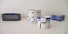
'A Willow for Ai Weiwei' Blue print on willow pattern porcelain serving plate - Stiegsnaes & Barsebaeck plates - Trees, Cups & Bowls
 Ane-Katrine von Bülow (DK) www.anekatrinevonbulow.dk
 Ane-Katrine von Bülow was educated at the Danish Academy Design School and is one of Denmark's leading ceramic print artists, who has long worked with form and graphic surface, mixing digital mapping with low-tech paper transfer print processes.
“At the exhibition, I will show Serigraphic Fragments on simple geometrical three-edged forms.
The black/white graphic ornamentation is softened in grey tones by raster; - a raster in the form of nets, a repeating pattern, an ornament in infinite compositions ever-changing between positive and negative.”
Slip-cast porcelain, under glaze oxide pattern, mat glaze outside, shiny inside. Computer designed silk screen/serigraphic full body printed. H 24cm W 20cm
 Stephen Dixon (UK) www.artdes.mmu.ac.uk/p/sd
 Professor Stephen Dixon is head of craft research at MIRIAD (Manchester Institute for Research and Innovation in Art and Design) and is well known for his research into ceramic print processes as well as his political works.
Dixon has recently become interested in the evocative, narrative qualities of historic and archive documents. This interest began during a six month ceramics residency at the Victoria & Albert Museum, London (2009-10) and has developed over subsequent projects.
Inventory a series of digitally printed porcelain plates made during the V&A residency, combines drawings from the sculpture collections with original archive documents relating to the collections. Letters from Tripoli was the result of a chance find in an Italian flea-market. It was created for the project Memoranda at the Craft Study Centre, Farnham, UK in 2011, and consists of a series of found ceramic shards, over-printed with fragments of authentic archive documents and photographic images, which collectively piece together the story of an Italian prisoner of war in WW2. Janus Head is a large, composite head, based on the two-faced Roman God, a metaphor of the V&A ceramic collections.”
 Richard Shaw (USA) www.richardshawart.com
 Richard Shaw based in Berkley California is best known for his pioneering, surreal, trump l'oeil sculptural forms. He has been a significant figure in American ceramics for over forty years and has an international reputation.
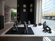
3 pieces: Bray Show (edition 3)- Willow ware with Pin Cyshion - Letter to Alice.
 Lesley Baker (USA) www.lesleybaker.com
 Lesley Baker works as Assistant Professor of Ceramics at Herron School of Art and Design IUPUI, Indianapolis, USA. She graduated from Rhode Island School of Design.
“My work is about creating pieces with a level of subtle social statement and much like how we are presented information through mass media, the true message is not always obvious. I use floral imagery to represent the past and the power of nature, and also as a device to entice the viewer. The themes include but are not limited to global warming, war, mass media, and things that in general feel like they are beyond our control. The messages are subtle because I want the viewer to be engaged and not immediately confronted.
Layering of imagery has developed from my background in architecture and the idea of façade, a skin on a piece that informs the viewer and provides multiple levels of meaning. To achieve my desired results I utilize traditional ceramic image transfer methods from screen print of ceramic media to newer digital processes.”
3 wall pieces: Declaration - Sheriff's in Town - El Dorado.
 Charlotte Hodes (UK) www.charlottehodes.com
 Charlotte Hodes is Professor in Fine Art at London College of Fashion, University of the Arts London.
She studied at the Slade School of Art, University College London as a Fine Art undergraduate student (1978-82) and postgraduate student in Painting (1982-84).
She has worked in a variety different media, including paper, textiles and ceramics. She made a significant body of work in collaboration with the Spode factory before its closure and is working with Paul Scott on new research into the Spode Archive.
Charlotte Hodes’ ceramics are informed by her practice as a painter. She utilizes the ceramic surface as a three dimensional canvases onto which she draws her images. Her iconography is centred on the female figure within a contemporary context depicted as a silhouette juxtaposed with motifs loaded with female associated references. It questions the position of the female figure as represented in art history, as a decorative motif and as being inextricably linked to the domestic. The ceramic platters, plates and vessels, as objects themselves refer to the feminine and domestic whilst also offering up visual motifs which in turn form part of her imagery.
The dishes represented in this exhibition were made during Charlotte‘s short placements at the ceramic factory Spode (1998-2004) in the UK, where she had open access the Spode historical archive of copper engraved sheet and chintz transfers. For her, this was a usable archive of collage material to be cut up and reconstructed for the creation of new incarnations.
2 unique one-off pieces made at the UK ceramic factory Spode.
Material/technique is copper engraved tissue transfer from Spode archive in Cranberry on Spode china. 29 cm diameter.
 Megumi Naitoh (USA) www.meguminaitoh.com
 Megumi Naitoh is an emerging American artist working with screen printed imagery sourced from cyber-space, collaged with personal imagery. Her artwork plays with surface, media, technology and our perceptions.
“Since 2001, I have been interested in Roman mosaics and their narrative depiction of daily life. I am intrigued by how the mosaics consisted of small pixel like squares that were structured in a non-grid, free form manner. I responded to the Roman mosaics by creating portraits with visible pixels. The tightly configured grid structure of the digital pixilated portraits is contrasted against the more free-formed Roman mosaic aesthetic. The portraits are abstracted and made indefinite by pixilation and present anonymity. The landscape format, size, and frames reference smart phones or computer monitors and suggest internet communication and online activities.
My current work references mosaics and tile murals. My main interest in online activities continues to manifest in this series, exploring the relationship between technology and our lives. In 2007, I became concerned with Second Life, a 3D virtual world. Second Life is created by its residents and inhabited by millions of users from around the globe who create many communities for entertainment, friendship, education, businesses, etc. Although users can express their identities by creating custom avatars, the environment is established to keep the residents’ anonymity.
Anonymous blogs, forums, and social sites are a new way of social interaction. They are quite unique to our contemporary lives. By creating two vantage points and presenting images from both the real and virtual worlds in one piece, the work expresses the integration of real life and virtual life, and how we quickly weave through these two worlds on a daily basis.”
'January 9th 2010' 40cm x 25cm x 5cm screen-printed earthenware 2010
'December 20th 2009' 43cm x 25cm x 5cm screen-printed earthenware 2010
 Laura McKibbon (CA) www.culdesacdesign.com
 Cul de sac products are all handmade in Vancouver, BC solely by designer/maker Laura McKibbon. With an academic background in sciences, she is a self-taught ceramic artist, whose work is not bound by labels or tradition. Her work incorporates hand built, functional ceramics with photography and printmaking.
“My work explores a sense of belonging; the feeling of home that connects us to our physical environment. Inspiration comes from the world around us; highlighting the unique yet universal personal experiences we have, embodying them in the ceramic surface as a way to make the temporary permanent.
This series is part of an ongoing inquiry into the relationship between landscape and culture. I am fascinated by the structure and predictability of the natural world and how the human experience; emotional, impulsive and irrational, exists within this ordered environment. My work features a strong graphic element, referencing the historical tradition of ceramic surface decoration, while reflecting aspects of contemporary life and celebrating the elements we inhabit.”
Cups and plate. Graphic print and color/glaze vary, textural imagery.
 Matthew Raw (UK) www.matthewraw.co.uk
 Matthew Raw graduated from the Royal College of Art in London 2010.
His impressed ceramic artworks are variously political and commemorative in nature. In 2011 he completed a commission for El-værket in Holbæk, Denmark.
“Working Title: An Artist Has Produce.. My talk at the Ceramic & Print Seminar will focus around art as a product, with the artist having/being/creating produce. I will create the pieces for this exhibition in the week leading up to the seminar, exploring these issues in three-dimensions.
Discussing and exploring this at Guldagergaard is special to me, as it was the first institution where I felt, and was treated like, a professional. The fact that it was in a different country appealed to me as someone who loves to travel, and was brought up in a house full of international people and global concerns. I have continued to work in other country's, and strive as an artist to discover exciting opportunities and experiences all over the place!”
Three wall mounted pieces, 40 x 40cm. Print/text stretched and distorted.
 Cathy Terepocki (CA) www.cathyterepocki.com
 www.hornofplentynews.blogspot.co.uk
Cathy Terepocki is a ceramic artist living in Saskatoon, Canada. She graduated from Alberta College of Art and Design in 2004.
“I have always been interested in collecting anachronistic objects. These objects, whether clothing, furniture or a patch work quilt act as catalysts for a myriad of imagined stories. They are clues about the society from which they came while allowing us to see the evolution of contemporary culture. My admiration of these objects has naturally transcended into my ceramics practice.
The search for images is a key element to my work. Ephemera, textbooks and other didactic sources are primarily where I find images, they are then re-contextualized on my ceramic pieces. What is of interest to me is how adding a layer of colour, texture, pattern and collaged print can disrupt their intended meaning, heighten their idiosyncratic nature as well as provide fragments of a narrative. Placing these images onto functional objects takes this a step further. It also allows the viewer to engage with the work on a different level when it becomes part of everyday use.
The forms I use are usually wheel-thrown. The surfaces are developed by building up layers of print including basic mono-printing techniques when the clay in wet, in-glaze or laser decals after the pieces are glazed and repurposed commercial decals to finish off the piece and provide one more layer of complexity, beauty and nostalgia.”
Small tumblers - underglaze, inglaze, laser and commercial decals
 Evelina Wojtowicz www.evelinawojtowicz.com
 Evelina Wojtowicz is a young artist living in Northern Ireland. She has studied Geology and Fine Art in Wroclaw, Poland, and continued her studies in Northern Ireland with a BA Hons Course of Fine & Applied Arts, 2009-2012, Diploma in Industrial Studies, University of Ulster, Belfast, 2010-2011, and BA Art & Design - Ceramics, Galway-Mayo Institute of Technology, Ireland, 2007-2009.
“In my art practice I am working with aspects of the feeling of space in between images, form, their layers and meanings. In experimenting with space, layers of allegories and their composition, my work draws the line between time and space through narrative, form and display.
Living, working and studying in different places such a Poland, Sweden, Ireland and the UK over the years, my biggest inspirations come from how we build our individual and collective identity of space between the present moment and memories.
A big part of my own art practice is based on the use of print techniques in the field of ceramics. Over the years I have developed a technique of applying the images by printing between very thin layers of porcelain, which allows me to get a unique effect of ghostly images seen through porcelain and within the form; unfolding the stories through certain light.
We find ourselves on the journey from the present into the past and the future and it is the just unpredictable NOW that I have been trying to capture in my work, so we can find ourselves between the layers of our own existence with its translucent meanings of life.”
3 cups - The project BEING BETWEEN is about being between the layers of our own being, between translucent meanings of life.The porcelain with printed drawings and archive images bring the story written between the past, present and future. The dialogue between high fired porcelain and glass stained together contains a real life of light in a very present moment as an example of contemporary lithophanes. The character of the girl shaded between all become to be again a witness, looking through, in and out of everything..