skip to main |
skip to sidebar


 ALL TIMES - Jars
Gunilla Maria Åkesson, Samuel Johnson, Lotte Westphael
Exhibition 13 June – 10 August 2019 July: Wed-Fri 11-18.00
ALL TIMES - Jars
Gunilla Maria Åkesson, Samuel Johnson, Lotte Westphael
Exhibition 13 June – 10 August 2019 July: Wed-Fri 11-18.00
ALL TIMES - Jars, forever valid and valuable in their time.
Each jar has its story, reveals who the artist is, the place and time it originates.
The jar may be close to tradition, shows a modern technical making process, or be a textural masterpiece - and still reflects hands and the intimacy and character of the mind.


The traditional jar may also be a contemporary concept, an attitude, an artistic expression that give an image of artistic movement and direction of time.


Today, ceramic is HOT. Everyone relies and falls in love with the history, spaciousness and stability of this material. The jar is a container that stores, contains and keeps in its interior space. Books are written in honor of ceramics and currently in a Danish TV program are the making and evaluation of ceramics.
For the gallery's exhibition Form Language 2014, Ursula Munch-Petersen quoted a Chinese wisdom book Dàodéjīng (The Way of Virtue) by Lao Zi, around 6th century BC: "The meaning of the jar is what is not - the space inside."
The form of the jar is described by its shoulder, neck and foot. From beginning of time the human is included in the jar as a figurative form, ornament, abstraction.
The three invited artists each have their reasons, but all have beautiful simple, geometric expression and material surfaces as their focal point - and the value of craftsmanship.
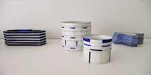
 LOTTE WESTPHAEL's ceramic [MINDMAP] is based on a crafty sublime technique that unfolds in a carefully designed graphic universe. Embedded in the pieces is the story of 'time'.
The pieces in the exhibition, MindMap are self-referring and new interpreted compositions from her previous vessels, on harmony and disharmony in patterns and colour composition, but in more colours and shades than before.


She describes the works as a stroke in a development process. Each work is a study of characters of colour combinations and spans in shade.
- Do they all hold up? What adjustments in the next series?
She starts two-dimensional by constructing patterns in ultra-thin porcelain sheets, which ultimately bend and assemble into cylindrical jars, to be subsequently immortalized in the firing process. (Photos: Erik Balle)
 SAMUEL JOHNSON's unglazed, functional pottery are wood-fired in an anagama-type kiln for 3-4 days. The rustic surfaces of melted ash and encrusted embers are by-products of this firing process.
Though appealing, these are incidental surfaces which are not meant to be decorative. The relationship of structures, issues of form or technique project a sense of order and subsequently disruption with elements that suggest disorder.


Samuel looks at old Silla ware, and most recently thinking about monochromatic painting. Inspired by artists Agnes Martin, Robert Ryman, the early black paintings of Frank Stella, Ad Reinhardt, Richard Serra.
His work holds the conventional notions of the pots – as bowl, as vase, as cup – to be easily recognized while other aspects of the work seem unfamiliar and austere. This tension creates a sense of mystery and invites engagement.
His ideas begin with research, inspired by much older forms. Not as reproduction of these things exactly, but an attraction to what feels significant.
He finds something powerful or contemporary in this historic reference and begins a process of reinterpretation. This approach also relates to a training as an apprentice within a generational ceramic tradition that requires a focused study of the tradition, until both technique and aesthetic sensibility is deeply instilled.
 GUNILLA MARIA ÅKESSON uses the classical cylinder shaped vessel as a white canvas to express her inmost experiences and feelings.
The pieces evolve with the change of emotions, and each series of work mainly get their individual expression by the use the glaze and slip.
The pieces hold a silent beauty of simplicity. The beauty that comes from within and evolves over time.


This intense notion of simplicity and strong presence are often what appeals to the viewer.
The inspiration comes from the continuous development of a creative process, the joy of being in the process trying out new ways to reach a desired expression.
The vessels are hand build by coiling and modelling the thin walls into large forms. The vessels are glazed with at least 2-5 different glazes and then fired several times to 1200C. (Photos: Peter Carlsson)
Grateful thanks to The Danish Art Foundation for project funding in 2019.
THE EXHIBITORS TEXTS AND BIOGRAFIES
 LOTTE WESTPHAEL - MINDMAP
My ceramic [MINDMAP] is based on a personal immersion in a technique unfolded in a graphic universe.
I work with systematics, order and serial studies of implements. Thematically, I am inspired by woven Bauhaus fabrics.
I have developed the technique within several years. With strips of coloured porcelain, I work with vertical and horizontal lines. I work two-dimensional in porcelain, where I build patterns in 2 mm thin porcelain plates, which are ultimately assembled into cylindrical jars: Syncopes (= rhythmic displacement).'
I am interested in the cylinders dimensional potential, and works with the interaction between the jars inner and outer space.
The making process is slow and the waste rate is large.
 And I'm concerned with the small and large displacements that I can make in porcelain strips for this artistic construction. I am looking for variation in the detail - which may be of interest to the viewer.'
METHOD - Some design approaches in the project:
- a colour matrix where I work with both the colour and its choice.
- Sections of geometric patterns, enlargement of these and repetitions.
- horizontal and vertical lines (some jars are collected by horizontal strips, others are joined by vertical)
- variation of porcelain strip width (narrow-wide-narrow, etc.)
Quote from the Application - Project support from the Danish Arts Foundation for production of works for the exhibition.
LOTTE WESTPHAEL (b. 1965) was educated at the Danish Design School Kolding 1988-92, Institute for Unika 1992-93. Studies in Japan. EXHIBITIONS 100 yeard in Danish Ceramics, Sofienholm 2019. [Albers] Translated into Transparency, Dina Vejling, Odense 2017. Ann Linnemann Gallery: Masterpieces 2018, World Cup 2017, Toy 2016. Charlottensborg Spring Exhibition 2016. INTERNATIONAL Lerverk, Göteborg. Danish Culture institute, St.Petersborg. Galerie de LÓ, Brussels 2016. Triennial of Silicate Arts, Hungary. Cluj Biennial Ceramics, Rumania 2017. Ceramic Art Andenne, Belgium. Farenheit 2018, American Museum of Ceramic Art, Plinth Gallery, Denver 2018. Biennale Vallauris, Design Miami-Basel 2019/Maria Wettergren Gallery. KAOLIN (solo), Stockholm 2019. AWARDS Danish Art Foundation, work stipend 2017, 18, project funding 2016, 18, 19. Arts&Crafts Award 2016. ”Villvinprisen”, Risør, Norway.
 SAMUEL JOHNSON
I have been exploring darkness in my work as a metaphor. In technical terms, the light-colored clay is transformed by reducing oxygen from the cooling phase of the firing and bathing the work in smoldering wood embers…. producing bands of color, iridescence, and dark surfaces that seem like shadows.
My aim is to produce raw unglazed functional pottery that is quietly confrontational, meditative, and still.
We have a capacity for reason and mathematical precision and yet are also half wild, full of biological and spiritual mysteries which drive our impulses despite existing, often, beneath consciousness. Poets refer to this as shadow – those aspects of our personality, our humanity, which are hidden from us.
Pottery’s capacity to carry a metaphor while remaining useful is an astonishing quality. Unlike paintings, or other forms of visual art where one interacts with the work primarily through sight, pottery can enter our lives though the body and our lived experience – though its physical balance, heft, and touch we experience its secrets. The best of this work enters slowly and over time with use.
SAMUEL JOHNSON (b.1973) is Professor of Art at the College of Saint Benedict and Saint John’s University and serves on the Advisory Board of the international ceramic organization, Artaxis. He has participated in several group and solo exhibitions including Jane Hartsook Gallery, NYC (2018, 14) and Beauty of Zen, Ann Linnemann Gallery 2016. COLLECTIONS the North Dakota Museum of Art, the Rourke Art Museum, the Minnesota History Museum. PUBLICATIONS New York Times (May 9, 2019) and several books: 40 Years On; Pottery of the St. John’s Pottery Studio (2019), Ceramics Now (2018), Mastering the Potter’s Wheel (2016), Ceramics Now (2014), and Stoked: Five Artists of Fire and Clay (2010). Samuel grew up on the western prairie of the Red River Valley, outside of Breckenridge, Minnesota (USA) in 1973. Before earning his MA and MFA from the University of Iowa (2005), he apprenticed with Richard Bresnahan (1996-1999), studied ceramic design at the Danish Design School in Copenhagen, Denmark (2000), and worked in Japan as a studio guest of Koie Ryoji (2001). He lives in rural St. Joseph, Minnesota, with his wife, Anne, and their four children, Harriet, Jesse, Ingrid, and Francine.
 GUNILLA MARIA ÅKESSON
I am a ceramic artist who primarily works with unique objects in clay. My inspiration comes forth during the creative process, where impulses and ideas develop gradually when I work with the object.
My objects are hand built. To build by hand takes a long time and it can often be monotonous, but at the same time I can experience it as a daily meditation. During the time it takes for my work to develop I start to see the potential in it.
The potential often appears as a feeling, the intuitive feeling when I know whether I am on the track or not. Here my curiosity and inspiration awakens because I find something in the form that I want to make clear.
It has a story to tell.
My way of using clay means that I often work with series of the same basic shape, but it always takes various forms. The result will be unique objects for exhibitions, public spaces and private homes.
GUNILLA MARIA ÅKESSON (b. 1963, Älghult, Sweden) studied at the National College of Art and Design, Bergen, Norway 1987-92. EXHIBITIONS Solo Blås & Knåda, Stockholm and Galleri PING PONG, Malmö. Modern Masters, Munich, 2019. Finalist, Loewe Craft Prize Award. Solo Puls Ceramics, Brussels. Contemporary Ceramic Center, London 2018. Collect, Saatchi Gallery, London 2013-18. COLLECTIONS Region Västra Götaland, Public Art Agency Sweden (Statens Konstråd), Arts Council Norway, Royal Department of Foreign Affairs (N), Innkjøpstfondet for Norsk Kunsthåndverk and several private collections in Europe. Member of Konsthantverkarna, Stockholm.
 BAD BOYS
- and other stories
Terracotta by Peder Rasmussen
Exhibition 9 May – 8 June 2019
BAD BOYS
- and other stories
Terracotta by Peder Rasmussen
Exhibition 9 May – 8 June 2019
BAD BOYS - and other stories (... of which many ends well)
Peder Rasmussen delivers his message in a humorous way - and in ceramics
that gets everyone on to the story and the connection with the material.


He debates with his contemporaries in the image vessels Bad Boys, Happy Ending and Old Goat with references to both #MeToo, and personal experiences.


We are surrounded by countless technical accessories that have become such a large part of everyday life that it is difficult to imagine the simple and physical presence. In contrast, more and more people have discovered the ceramic material qualities and possibilities of contact with the earthy.
 Peder Rasmussen is not truly down to earth, but can almost be called visionary - if he is at all to retain!
But he speaks with both a presence and a relevance that causes us to listen... - or look for when it comes to his images on the ceramic vessels.
Curiously, we may move around his pieces to bring it all in.
Or simply rotate them, what the exhibition opens for.


For the exhibition he has looked at the Greek, Roman and Etruscan terracotta vases, painted in simple contrasting colours.


He writes about his new pieces: "..it would be interesting to see - in a world where all sorts of materials and techniques are available and used to a great extent - what one might even do if one were imposed such strict restrictions.


What if one only was allowed to use non-glazed clay and a single colour?
How are you artistically influenced by such limited possibilities?
When the choice consists of whether it should be a black figure on the clay background - or vice versa. A bit like using black/white rather than colour photos. A kind of 'dogma' for ceramists.. "
See the full text in the end of this page..

Peder Rasmussen is a potter, artist and one of Denmark's few great cultural personalities who takes the ceramic profession seriously. He gets involved in everything from writing critical submissions to as an author publishing ceramic-themed books.
For ceramists and other good people, he is an eternal debater and sometimes provocateur - but first and foremost one who can do his craft and play with all sorts of humorous angles, with a sharp tongue, a clear eye and look for historical themes that he rethinks and engages in with his works.
As a writer, Peder Rasmussen has enriched his readers with the art historical story "Family on a Wooden Leg. About J.F. Willumsen's Family Vase, 2016”.
He writes to his audience about the ceramics techniques and some would say "nerdy" analyses of glaze chemistry and material understanding, so that almost everyone can be involved, while giving a personal insight into the historical time that created this masterpiece.
Previous exhibitions at Ann Linnemann Gallery were 'SLEIGHT OF HAND' in 2016, when the works under the pseudonym Gert Pedersen were performed in close collaboration with Michael Geertsen, an exhibition that offered illusionist works.
 They took us on an adventurous journey where everything could happen... and happened. Animals and humans appeared from known and unknown worlds, tumbled around in a universe of jars and geometric shapes, where it was only kind of safe to enter and try on new achievements.
 IN THE WOODS in 2011, the figurines and dishes occurred in the winter (2010-11), where Peder Rasmussen worked with the Italian majolica technique, he first encountered when he in 1970 for a period settled in Faenza, the hometown of faïence.
Grateful thanks to The Danish Art Foundation for project funding in 2019.
TEXT BY PEDER RASMUSSEN
BAD BOYS - and other stories
(... of which many ends well)
Terracotta by Peder Rasmussen
TERRACOTTA
Some of the best ceramics I know are the Greek, Roman and Etruscan terracotta vases found at both the Danish Glyptotek and National Museum - and in numerous other collections.
Just simple materials: earthenware clay with black colour - that's it!
 I have long thought that it would be interesting to see - in a world where all sorts of materials and techniques are available and used to a great extent - what one might even do if one were imposed such strict restrictions.
What if one only was allowed to use non-glazed clay and a single colour?
How are one artistically influenced by such limited possibilities? When the choice consists of whether it should be a black figure on the clay background - or vice versa. A bit like using black/white rather than colour photos.
A kind of 'dogma' for ceramists.."
Would this fact itself generate new stories? Is it perhaps the case that the endless technical possibilities in reality may seem inhibitory to the narrative that pushes itself on?
They also require their place. In much contemporary ceramics, the material is almost the story itself. There I am not!
 In any case, I wanted to submit to these conditions and see what would happen.
I am a trained potter, so wheel throwing would actually be the natural way for me, especially when it comes to circular shapes.
But here too I have simplified: All forms are modelled.
The interesting thing is that where the relative high speed of the turning process is forced to relate to the profile, where you work, then the slowness of modelling allows you to relate more nuanced to the whole shape and a more varied textures.
My new vases are basically symmetrical, but modelling has made them slightly more vivid in shape - I hope then.
The circular jar is an ideal background for stories of almost cinematic character. This the ancient potters knew all about. Most of my new jars can therefore be considered as visual tape loops. The motif wraps around the form.
What you see right now creates expectation of something more. You become curious. Contrary to how it relates to painting, one can not see it all at once.
You have to move - or turn the vase. It is a dynamic imagery where the rhythm plays a crucial role - it runs the game.
 I have worked with elongated oval shapes as well.
Here the image is divided into two sections.
The old ones achieved the same thing by using handles on the corpus. Nice for depicting here and there, before and after… etc.
When you do not have many colours to work with, you have to be inventive with what you have. Therefore, this technique starts an intensive use of variations between, for example, black line on red area, red line in black area.
You scratch, scrape and paint, but only one colour is allowed: black!
Ornaments will play the same role as graduations when working with multiple colours and glaze. The "empty" areas must also live, even if they are not directly in the story. In many ways, it is a bit like in early woodcuts - or in frescoes, which for some reason I have also got on the brain during this process.
 The vases divide into two main groups - the very direct narrative and then some more cryptic... also for myself.
In the narrative vases, the story is often tied together by ornamentation. It has mostly to do with a sense of visual necessity. Maybe also with the "horror vacui" which I probably suffer from.
However, I praise myself that a single high vase is completely without decoration, that is pure form - just rhythm in the accumulation of its elements.
The "cryptic" often portrays people who are mustering around in an unmanageable and fragmented world. I have sought inspiration in the Renaissance and Baroque Grotesques, which is actually an ancient Roman artistic strategy.
THE CONTENT
The universe of the jar - to call the double-curved forms somewhat pretentious - is extremely suitable for characters floating weightless in their own world.
And my jars are full of characters - gentlemen, ladies, animals, objects and ornaments in more or less pretty interactions. I would be stretching the point too far, if I claimed that there is meaning to it all.
In fact, I have called one of the jars Stop Making Sense, a line from an old song by Talking Heads, that a few years ago was the theme of a whole line of image vases that just aren't included here.
 But some of the vases have a rather specific content.
Not heroic as so often in ancient times, but more simultaneously - closer to anti-heroism.
Because while I have worked with the series, the #metoo campaign has ravaged the entire cultural landscape.
One has, in one's capacity as a man alone, had to see oneself acclaimed as almost untamable wildlife.
So my vase Bad Boys is a pure confession: yes, we are driving too fast - yes, we are looking for the girls, at least - yes, we eat and drink ... and smoke!
And we fart!
In short: Our unbearable act is unbearable, and the world would surely be a better place without us. But maybe just a little boring…?
 Another vase, Happy Ending, is that although the encounter between the sexes may occasionally begin a little awkwardly, perhaps most often, so is the chance that it may end well, present. Take it from a man who has been happily married for over forty years.
 A larger oval vase, Party shows a social occasion here in the house - at least a larger gathering.
I have always been attracted to depictions of many people in some form of dynamic interaction, but have never really been able to figure out how to do it on a vase.
I am a great admirer of Max Beckmann and R.B. Kitaj, who to a large extend had human trouble on the program - and this vase is inspired by both - and then Corbusier, who gave me the idea of putting in the big unifying ornamental figures over the plot.
 Old Goat is the story of, oh yes, the old 'goat', throwing himself into another round.
The circular shape of the jar is used as a background for a procession of tumbling figures.
No particular moral - or morality!
The last section of the exhibition consists of a few figures that were almost as a conclusion of the project. Several of the ornaments and details that otherwise appear on the vases have here moved out into free dressage.
Here, too, there is not much meaning to be found, but hopefully a nice drizzle of visual poetry, which is what everything is about.
BIOGRAPHY
PEDER RASMUSSEN was born in 1948. Ceramist and author. Educated at The Kähler Ceramics in Næstved 1966-70. Istitutto Statale per la Porcellana, Firenze, Italy 1970-71. Studio with ceramist Karen Bennicke since 1972.
Member of the exhibition groups MULTI MUD 1980-85 and END 2007-08.
Guest teacher at the Design School in Kolding 1983-99 and Denmark's Design School 1991-95.
Curator of several exhibitions eg. At the Design Museum Denmark, The Kähler Keramik, 2002 and J.F. Willumsen's Family Vase, 2016.
Author of the books: Kählers Værk, 2002. Reistrup, Udsmykninger & keramik (Commissions and Ceramics), 2006 and Family on a Wooden Leg. J.F. Willumsen's Family Vase, 2016.
Chairman of the Danish Art Foundation for Crafts and Design 2011-13.
GRANTS and AWARDS Kaj Bojesen's Mindelegat, C.L. David's Foundation, Ole Haslund's Artist Award and OJD-Foundation's Ceramics Award, and the Danish Art Foundation Lifelong Award.
MUSEUMS and COLLECTIONS Victoria & Albert Museum, London. Design Museum Denmark. Art Museum Trapholt & CLAY Ceramics Museum Danmark. National Museum, Stockholm & Röhss Museum of Decorative Art, Gothenburg, Sweden. National Museum & Nordenfjeldske Kunstindustrimuseum (National Museum of Decorative Art and Design), Trondheim, Norway. Keramion, Frechen, Museum für Kunst und Gewerbe, Hamburg & Hetjens Museum, Düsseldorf, Germany. Danish Art Foundation, Sweden & Denmark, Annie & Otto Detlef's Foundation, Denmark.
www.pederrasmussen.dk
FILM - part 1: www.youtube.com/watch?v=XXcNWV8kmaM&feature=related
FILM - part 2: www.youtube.com/watch?v=u17BfEl4f0U&feature=related