skip to main |
skip to sidebar
CLICK photo = LARGE format + slide show..


 THROWING THE CASE... Theme II - young talents
Ninna Gøtzsche, Marie Torbensdatter Hermann and Kirsten Høholt
Exhibition 6 February - 1 March 2014
Artist Talk: Thursday 20 February at 17-19.00
The Craft in Art and Art in Craft - Applied Art and Ceramic Contemporary..
This themed exhibition of young talent shows work by Marie Hermann, Ninna Gøtzsche and Kirsten Høholt. They work in unusual ways with hand-thrown forms and traditional craftsmanship.
They were born the same year, work internationally and studied in England.
Their conceptual standpoints with reference to crafts come into play and create dialogue on new ways of relating to everyday utilitarian objects, function, ceramics and pottery tradition.
This exhibition shows thrown forms as a concept – craft in contemporary art.


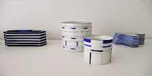
KIRSTEN HØHOLT was educated in England, combines drawing and ceramics in personal tactile images on hand-thrown utilitarian objects. For the exhibition, she decided on the thrown plate, wall objects in bright colors and delicate lines.
MARIE HERMANN was educated in England, now living in the USA, working with still-life and formative juxtapositions in everyday scenarios. She throws or hand-builds depending on what technique makes sense for her idea.
NINNA GØTZSCHE was educated in Denmark with studies in England, expresses herself in clay, tells stories of shape, material, idea and immersion. Her new work Uncultured Breakthrough is inspired by vases from the Royal Copenhagen Porcelain Factory.
Photos of earlier works by - Kirsten Høholt - Marie T Hermann - Ninna Gøtzsche:
.jpg)


Each exhibitor has described their personal concept and basic philosophy and answered the questions: - What is different from your previous works?.. Unique, new and surprising?.. Interesting for the viewer?.. Inspiration, origin and originality?.. Material and technique? - 10 significant professional events...

KIRSTEN HØHOLT – www.kirstenhoholt.dk
"My overall concept is combining drawing and ceramics.
For this exhibition I have chosen to use the plate, because it is a good format to draw on, and the 'platter' is a funny thing.
It is one thing to draw on paper and frame it. This is to touch, - a tactile drawing.


Drawing means a lot to me. Playing with image metaphors. I simply like to draw, and I like to make pottery. I have chosen to use a hand-thrown shape, because I want to create as much life as possible.
- I am working now with motifs directly onto the clay.
Previously, I have worked on paper and transferred the decoration to the ceramic object in a last firing. The paper drawing, I had printed in ceramic colour, I then transferred to the glaze fired ceramics as a children's tattoo, before the last firing.


- This time I have thrown myself into deep water. It is 'one shot' and you can not move things around. It is not a design process, but very direct. Layer upon layer of colour, scribble and print. I am now much more down into the layers, whereas the other just like remained on the surface.


- It is like a little 'photograph' from my brain. It is hard sometimes to be part of the drawing. - Why did this come into the drawing?. Sometimes there is something, I do not want to see - but it was there. Where did the motive appear from? Things in the drawings come from different places that I know when I see them drawn, but may not be aware of when I draw them. Therefore the motives also surprise myself.
- I want it to make people smile. Something positive and some comments - without being political or point a finger. I hope for familiarity, informality.


- My paintings are everyday ruminations, little thoughts and conversations .. I am thinking of words, phrases, metaphors, sounds, clear and messy impressions distinct stories - and feelings.
- Hand-thrown, porcelain slips - painted, drawn, mono-print, transparent glaze, photo decals. Fired 2-3 times at 1000-1260 C."


Born in 1979 - Graduated from Bath Spa University (ceramic department) Somerset UK 2000-04. Participated in 'Network Europe', International Ceramic Centre DK 2004. - POTTERY TRAINING at Mark Smith Derbyshire, England 1999 and Ann Linnemann studio, Copenhagen 2000 - MEMBER of the Danish Arts and Crafts Association from 2012 and the studio Formateket since 2008 - SCHOLARSHIP Obel Family Foundation 2002 - EXHIBITIONS 'New Designers', London 2004; Jug Exhibition, Blaze, Bristol 2006; 'Formateket' 2010 and 'Masterpieces' 2013 Ann Linnemann Gallery, 'Young Danish ceramics' Gallery Rasmus 2009; 'Network Europe' International Ceramic Museum - Grimmerhus 2005.


MARIE TORBENSDATTER HERMANN - www.mariehermann.dk


 "Over the last years I have worked with a series of Still-Lifes where I investigate formative juxtapositions through functional, tactile and stylistic associations.
The pieces are a kind of aesthetic scenarios which seek to bring attention to the transient everyday scenario, that you can find on the shelves and tables in the kitchen and bathroom. But in my pieces functionality has been taken away to highlight the formative relationships and the qualities in the everyday object that lies beyond the purely practical.

 - I hope for a dialogue between the pieces, the viewer and the everyday object.
- Everyday life and our relationship to the objects we live with. Still-life of a moment where two objects meet.
- I work in stoneware and porcelain, hand-throw and hand-built depending on what technique makes sense for the given work. I use wood, yarn and other materials."
Born in 1979 - Graduated from the Royal College of Art, MA, London 2007-09, University Of Westminster, BA Ceramic, London 2000-03; - SOLO EXHIBITIONS 2013 Galerie Nec, Hong Kong - A Gentle Blow til Rock, Re: View gallery , Detroit, USA, at 2012 Galerie Nec, Paris - France, 2010 Stillness in the Glorious Wilderness Matin Gallery, LA, USA, 2009 To the Legion of the Lost, Sixpm, project space, London, UK; - FUNDS the National Danish Arts Foundation - Annie and Otto Johs Detlef 'travel grant; - COLLECTIONS Denver Art Museum, USA - Nordenfjeldske Kunstindustrimuseum, Norway - Sevres Museum, Paris.


NINNA GØTZSCHE - www.formuleret.dk - Uncultured Breakthrough
I develop and experiment my ceramic languages all the time and am concerned with how form, idea and material converge into Arts & Crafts.
With my pieces I try to tell a story, a ceramic story. It is not told with recognizable images and signs but with shape, material, idea and immersion. The language of the story, I find in the maze of history and experience and by hearing others' versions and visions. I express myself in clay.
 - Uncultured arose from a desire to do something gross and not so nice. The clay is thrown thick, afterwards I cut into it. Uncultured Breakthrough is carved throughout. Inspiration is the penetrated vases from Royal Copenhagen, but my version is different. They are crude and the material bulk. Something is hiding behind the breakthrough, you can glimpse something lighter and softer.
The hand-thrown form is destroyed, while there is no doubt about the background in the functional. Precisely because it is the hand-thrown form in the fine porcelain, that has been chopped into, it is uncultured.
- I wanted to do something rough, something that describes life's not so pretty sides. But where the rough is nicely wrapped in a fine ceramic glaze. With Uncultured Breakthrough I have gone one step further and left something behind the coarse within the rough.

 I have always worked ahead with the thrown forms, once they have left the throwing-wheel. Sometimes it has been by pushing them, sometimes by cutting and assembling them back together. With the series Uncultured, I am working more roughly and less harmonious and neatly. I hand-throw the shapes thick, then I jag and cut them. I even cut completely through them, so you can see what is hidden inside.
- Porcelain is a material traditionally for making perfected objects. I take the fine material and do something rough and uncultured to it. It is the destruction of the hand-thrown form and the very fact that it is the functional form, that makes the destruction tend to be stronger.
- I show, that in the fine material, porcelain, there can be created a rough, hard expression. It is also a destruction and renewal of the hand-thrown form and the tradition of perfection. Destruction because I deliberately target the unsightly. Renewal because I have yet not left the functional - things can still be used. To show the rough, the unsightly on a hand-thrown functional form, makes the artistic expression strong, because it is surprising this way.
- (Inspirational) Uncultured / Messy. Belching / Slanderous. Coarse. / Raw. Ugly. Uncivilized. / Uneducated. Inelegant. / Awful. Disorderly. / Sloppy. Thick. Foolish. / Grim. Swagger. / Immature. Improper. Unfinished. / But with a nice yellow glaze.
- The pieces are made of thick, hand-thrown porcelain, which I cut and chop up. Uncultured is made of several thrown parts that are put together. - Glazed with a green glaze and fired to 1280 C."
 Born in Lemvig, 1979. Educated at the Glass and Ceramic School on Bornholm 2001-04. Assistant at Julian Stair, UK 2004-06; Pottery Diploma School, Sønderborg 1999.
SELECTED EXHIBITIONS - 'SOFA Chicago' Cultural Connections, USA 2013; 'Collect' Saatchi Gallery, UK 2013,12,11,10; Ceramic Art London, Royal College of Art, UK 2013,09,07; 'Ætlinge' (solo), Officinet Kbh. 2012; 'SOFA New York' 2012; Functional, The Leach Gallery, Cornwall, UK 2010; 'Talente' München, DE 2009; 'Clay 08' SAK, Svendborg; 'The Rising of Danish Studio Pottery' Brewery Arts Centre, UK 2008; Salt Gallery (solo), Cornwall, UK 2006; - GRANTS: Danish Crafts 2013,12; National Danish Arts Foundation 2012; National Banks Anniversary Foundation 2012,11; L.F. Foghts Fond 2012,04; Kulturudviklingspuljen, Aarhus 2012,10; Det Reiersenske Fond 2004.
CLICK photo = LARGE format + slide show


 LIGHT & SHADOW - Construction Theme I - young talents
Theis Lorentzen, Pernille Pontoppidan Pedersen, Alikka Garder Petersen DK
Exhibition 9 January – 1 February 2014
Construction and other constellations – in light & shadow meet order & chaos.
For this first themed exhibition of the year the exhibitors have related to construction, yet they stay fundamentally different in their ideas, sensuality, expression, form.. - function and aesthetics.
Alikka Garder Petersen works with light and shadow in geometric space, Theis Lorentzen creates a dynamic universe of objects in colour harmony and balance, while Pernille Pedersen Pontoppidan challenges chaos and randomness in expressive installations.
THEIS LORENTZEN - Animated Abstractions


THEIS LORENTZEN creates "an animated world of objects and wall installations, where colours and forms are part of a dynamic interaction. Objects and juxtapositions provide a fun, simple and harmonious universe where play mixes with beauty and perfection, and where delight, serenity and the beautyfull are in focus. Colour and texture are put together in a simple graphic form which gives an animated, dreamy and almost unreal expression.."


 Educated in 2009-12 at the Danish Design School/ Royal Danish Academy of Fine Arts Schools of Architecture, Design & Conservation, Bornholm. Product design for Kähler Ceramics 2013..
PERNILLE PONTOPPIDAN PEDERSEN - Plinth


She cultivates contrasts and seeks out areas of tension. "The ceramics are grateful in its tradition and history to deepen and perpetuate the culture to new dimensions. The tradition gives much substance to work with to build contrasting works that grow on ceramics tradition, but move it toward new directions. - Challenging the work practices and cultivating the final object with its errors, or non-error.."
 Born in May 1987. Educated in 2012 at the Royal Danish Academy of Fine Arts Schools of Architecture, Design & Conservation, Bornholm. EXHIBITION 2013: 'Software & Glorified Ingratitude' Copenhagen Ceramics.
ALIKKA GARDER PETERSEN - Movements & Moments


"My overall concept is to work with space, light and material. All places effects these three elements much in the bodily experience of a place and space. It is in the shape that angles, definition of space, color, light/shadow surfaces, material clash at once define a space and give it tactility. This I have translated into my primary material, porcelain. "
Born in 1971 - Educated in 2003 at the Danish Design School, glass and ceramics (1 ½ years - interdisciplinary). INSPIRATION from travel and residency: Japan - lectures and tutorial at Osaka University learned lacquer work, Nepal - inspiration, material, peace, ethics, London - work in paper, Oxford - light objects by Margerite O'Rocke UK...
Each exhibitor has described their personal concept and basic philosophy and answered the questions: - What is different from your previous works?.. Unique, new and surprising?.. Interesting for the viewer?.. Inspiration, origin and originality?.. Material and technique? - 10 significant professional events..?
THEIS LORENTZEN - Animated Abstractions
The project is based on a module system of shapes and colours that can be stacked and linked together like building blocks. They are simple parts, when put together turn into a complex unit.
The objects are characterized by movement and flow, stiffened, fluid motion, chopped up into pieces, a 'flow' in stop-motion. A dissection of nuance and modulation shape and colour - perfect, nice and flawless, without a trace of real life trivial difficulties. The beauty of a synthetic 'Disney fixation'.
The colours are kept within a limited palette and runs in a fine graduated scale, with only a small leap of valour and tone, they are delicate and gentle, harmonious and balanced. Likewise with the forms that are variations of the same simple geometric element, a cone, varying in size, angle and cutting.
The new pieces are an extension of my previous works, but differ in that I bring more colours into play, creating more dynamic objects and remove references to the function. The works consist of many more smaller elements in many more colours. Single elements are more inclined and in varied sizes, allowing more dynamism. The new works hang or lie down with very small contact points, giving a light and airy look. They are in stained unglazed porcelain and do not have a back side or bottom, and thereby allowed to be placed in different ways.
I have explored numerous possibilities for combinations and variations how the object is constantly changing, shifts slightly compared to the previous one and gets its own personality. I have strived to achieve harmony and balance between the parts, yet also cause it to be dynamic and moving.
- My project is also interesting by virtue of the choice of materials. The texture in the matte and monochrome materials, combined with the fragmented design language, offers a special atmospheric, dreamy and almost unreal expression. Coloured porcelain is seen most commonly for functional objects, It is new to use these qualities for non-functional exhibition objects.
- The pieces are form studies, a play with and study of form, colour, mood and intuition. They create a universe, an amusement park or a dreamscape, and is mainly just to be experienced, seen and enjoyed - the subtle colours and shapes, gradients and tones.
- My inspiration comes clearly from playing - a play with beauty and perfection, harmony and balance - a play with construction and structure, complexity and simplicity. I create a fun, informal and animated world with inspiration in the digital and the mechanical, axles and crankshafts, graphs and charts, but in a simplified, distorted and surreal way.
- Casting in stained porcelain slip fired to 1260°C and then water polished and epoxy glued.
Graduated from The Danish Design School, Bornholm (ceramics) 2009-12 (The Royal Danish Academy of Fine Arts Schools of Architecture, Design and Conservation). Kerteminde Art School (ceramics) 1998-99, Nic. O. Schmidt bronze foundry in 1999, Precious Foundry Francois Deletaille 2000-2007 .. SELECTED EXHIBITIONS school projects Grønbechsgaard 2010/12 and Formland 2011 Graduation Exhibition Bornholm Art Museum and School of Library 2012; Upcoming Designers (Formland) 2012 .. ASSISTANT A.Tophøj 2012 (Elitist Folklore - Copenhagen Ceramics), Ole Jensen 2012 (Form & Fantasy), Anne Tophøj & Steen Ipsen 2011 (Extrudox A/S - Ann Linnemann Gallery) .. TEACHER Danish Design School, Bornholm 2012-2013, Kofoed School and AOF 2013; - EMPLOYEE Ditte Fischer 2013 Product design for Kähler Ceramics 2013 ..
PERNILLE PONTOPPIDAN PEDERSEN - Plinth
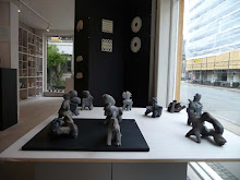
The podium is dominant in the work. What supports and elevates the work, makes the work what it is. Art is elevated objects. Raised on the podium in the given white space occupied by the viewer in almost ceremonial matters. Pure white podiums revealed in the spotlight elevates an unthoughtful immediate ceramic lump that does not deserve exaltation. I want to search for dialogue and contrast between the podium and 'the piece'. The viewer must unconsciously decide which of the objects deserves exaltation. The institution's control is supported in the podium's purity, order and structure - whereas the art's devilish, overstated, emotional and uncontrolled is symbolized in a lump of clay made in rapid chaotic movements with the intention to provide randomness and an uncontrolled object.
In my previous works, I worked a lot with a synergy of the anti-aesthetic through a wild mix of form, color and materials. In my exhibition at Copenhagen Ceramics, there were different expressions brought together in an attempt to achieve harmony in diversity. The works for this exhibition arose from a new idea and thought of letting ceramic plinths be the mainstay in the works. I have previously used ceramic plinths in my works, this time I let podiums be the dominant element in the works.
- I have in my work always used many different materials and colours. This time I made the conscious decision to keep it colour neutral in glaze and type of clay. I have instead allowed the different types of clay within a colour tone create the surface of the pieces. It is new for me to work in a prettier and cleaner appearance. I wondered if I could obtain my expression, in the new pieces.
- It is entirely up to the viewer whether my projects are of interest to the outside world. I carry out my projects for the simple reason that it is a great joy for me, and I also have views of the heart I would like to share with those, who are curious about my art. I would say that my art will be interesting to the world in that I work with this material with an immediacy and honesty. I want to place ceramics as art. Want to create this without some innate prejudices and fixed patterns. I dream of having the ceramic art world taking itself seriously as an art form. The fact that it moves away from its present stance; an inferiority wasteland between arts and crafts.
- Distance to the world and the city mentally and not necessarily physical. Escapism. Contrasts between rich and poor, between ugly and beautiful. A visit to Lidl to inspect the poor quality and cultivating aesthetic, or lack thereof. Knowledge of hazardous materials and their properties in ceramics. I get excited when I discover some new values of ceramics materials. I want to find new characteristics of materials used in the traditional manner. Using Danish blue earthenware to create an idiom in the same way as that managed the glaze, with the use of its plasticity in the modeling process. Creating a roaring whirlpool of foam using crushed glass jars. All materials undergoing a transformation in the kiln and turn out surprising after cooling down gives me an impetus to continue to create.
- The pieces are based on materials in various types of clay, this time the white clays. Porcelain, white stoneware, earthenware, white charmotte, dog hair, icing, crushed glass.
Born in May 1987. Graduated in 2012 at the Royal Danish Academy of Fine Arts Schools of Architecture, Design and Conservation, Bornholm. EXHIBITIONS 2013: 'Software & Glorified Ingratitude', Copenhagen Ceramics DK; 'Terres - Copenhagen Ceramics Invites', Galerie Maria Lund, Paris; 'Good Bones' - juried exhibition for young artists, Copenhagen City Hall, - 2012: 'Edge/Kant', Exhibition Building KADK, 'SiO2' Graduate exhibition KADK on Bornholm Art Museum and Designer Zoo, Copenhagen; 'Bornholm Juried Spring Exhibition' Svanekegaarden, 'Process' Grønbechsgaard, Bornholm ..
ALIKKA GARDER PETERSEN - Movements & Moments
Alikka Garder Petersen sees his work for the exhibition as a study of material and space. She shows two different groups of works: one is small panels to hang on the wall. The objects are mainly soft, but tension curves are formed by a play with the illusion and a flexible element within a stated frame. Just as the previous 'peek boxes' is here created a snapshot of a story/process. Something has happened prior to the freeze, and you can form ideas about what is happening next. Words a colleague said on them: graphical, aesthetic, calm but dynamic, humorous.
The other group is an enlargement of the flexible element partially freed of the frame. Still a play and investigation of space and curves working with boundaries and the respect for the material, porcelain. All objects are simple in coloured castable. To add excitement, a humorous commentary on an otherwise aesthetic form, is added either a hard yellow glaze or elements of wood, playing against the porcelain.
This process has been very experimental. Distinct from earlier, starting point has been physical 3D sketches on paper. I have transferred some of the paper's potential and quality for design. Transferred to porcelain, I have technically a very short time for the design itself. Therefore, the final forms are much more spontaneous and immediate.
- The surprise is to evoke the illusion of making a hard material soft and flexible.
- The interesting is presenting the viewer to my choice of freeze in the process/movement. Give the viewer a version of how I experience space and material.
- My inspiration is a study of space and utilization of this in paper. A sketch of light and shadow, space, inside and outside the frame. Originality is the transfer from one material to another in one, amusing consistency between the two materials and a respect and understanding for the materials paper and porcelain. The finished works are the originality the easy and humorous tale this frozen image of a process tells. Last but not least an understated combination of materials.
- Materials are coloured clay castable, glaze and wood. Since leaving school, I have been deeply in love with moulding technique with all that is involved. Plaster's precision with very thin edges, - porcelain together with light. I have developed my own techniques with plaster and castable that makes my designs freer.
- My goal is always shaping on the terms of the material, so that the material qualities show. Simplicity, honesty and contrasts are the means of expression. The moulding materials give some limitations that create the framework for the design which I love and can continue to explore and push to the limits.
Born in 1971 - Graduated in 2003 at the Danish Design, glass and ceramics (1 ½ years - interdisciplinary)
INSPIRATION from travel and residency: Japan - lectures and guidance Osaka University taught laquered, Nepal - inspiration, material, peace, ethics, London - work in paper , Oxford - light objects Margerite O'Rocke UK ... SELECTED EXHIBITIONS 'Biennale for Crafts and Design' 2011, the Danish Arts Foundation buy three lamps in 2010; 'Dina Vejling' Odense 2009; 'Hovdala Slott' Hässleholm, Sweden 2008; 'Solo Exhibition' Officinet, Copenhagen 2007; Biennale for Crafts and Design 2007; 'Light' Damhuset, Lyngby 2007; Represented in Gallery Nørby 2005-06; 'Biennale for Crafts and Design' Trapholt Art Museum and North Jutland Art Museum 2004.